How to Draw a Realistic Icon

Actually, there’s no single standard way in digital drawing, so we need not a tutorial to limit our minds. In addition, I’m not a master who can write a great tutorial, and my approach is very simple, just outline-fills-dodge, burn and done, so it seems there’s nothing I can talk. However, I still find there’re many enthusiasts still wandering outside the door, confused because they could not find the right way. The purpose of this post is just to stimulate more ideas from others. I hope there’ll be more better works showing up.

Personally, Photoshop is my favorite when I draw stuff. Some experts like using Illustrator for its vector feature, yet my style is more realistic and I always want to add some textures onto my works so vector drawing is just not my cup of tea. Aside, the biggest size of current icons is 512 x 512 pixel, so in my opinion the vector feature is not very necessary. (Here’s a great post: Icon Design: Bitmap vs Vector)

To be honest, icon drawing is more simple than other digital drawings because:

  1. 512 x 512 pixel is the terminal size.
  2. There’s only ONE project in most icons (1 or 2 accessories at most).
  3. Simple perspective. Only 2 ways: front view or 45° oblique view.

However there’re still some points should be aware of:

  1. The perspective MUST be accurate. It would be disgusting if you failed!
  2. The icon should be refined and elegant.
  3. Transparent edges. It must fit any background color.
  4. It’s important to analyse the light source (put it on the ground or desk).

Maybe there’re something more should be mentioned but I just have these 4 points in mind.

Whatever, let’s see the completed work here:

Click the picture to view in full-size

Click the picture to view in full-size

Firstly, let’s draw the outline of the object (in this case, the jar) with the pen tool:
jar_01

Right, the pen tool. You should use pen tool to draw any shapes (not the lasso tool) because the paths drawn by pen tool are vector so you can change it freely as you want. Try more times to adjust each key-point when you outlining.
jar_02

Notice that I used mask to cover up the stars, they are all drawn out actually. If you are lazy and just draw the appearing part, it’ll be troublesome when you want to change the position.

Now color it. Needn’t be too serious here, we can adjust its Hue/Saturation later.

jar_03

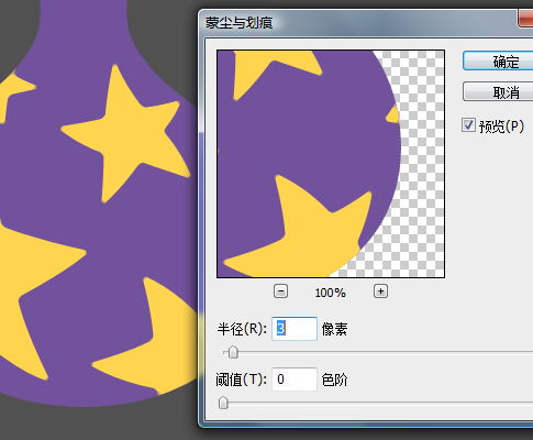
Rasterize the shapes and merge them into one layer (except the lip). Using Filter-Noise-Dust & Scratches to soft the angles of the stars (like colored glaze).
jar_04

Give it some noise to simulate the texture. Filter-Noise-Add Noise.
jar_05

Now we could make it 3-dimensional. It’s not magic but just shading chiaroscuro. DO NOT use Layer-Layer Style-Bevel and Emboss, it’s stupid. Just darken it. Use lasso tool to select the part you want to darken, feather it to 15 pixel, then use Image-Adjust-Curves. Remember, you could repeat this action, darken it a little each time, it will be more balanced.
jar_06

Following is the hard work. Use dodge&burn tool to go into the details. In general, if you want it darker, burn it, if you want it lighter, dodge it. You can also dodge it to correct back if you feel somewhere is too dark. This endless progress will give you a canvas-painting-like result which be around between reality and art.
jar_07

Well, it looks fine, but not great. How about this?
jar_08

I think you can figure it out. Give prominence to the highlight, make the colored glaze stars stand out, and add shadows. Now the highlight and glaze stars first:
jar_09

Be aware of that we can’t burn more on the high-saturation-yellow stars, so I just gave all of them a gradient from dark to transparent. To make the colored glaze stars stand out, I gave all the stars a layer style which includes inner glow (white) and outer glow (dark). This can make the stars blend into the jar body.

Then the lip of the jar. Firstly draw the highlight, then draw the lip. It’s just a simple ellipse, use some gradient. As for the shade of the lip, shape it then Image-Adjust-Curves on the body of the jar, it will be OK.
jar_10

Then the shade of the whole jar. 3 ellipses, use some gradient. Using only 1 ellipse as shade is not very professional.
jar_11

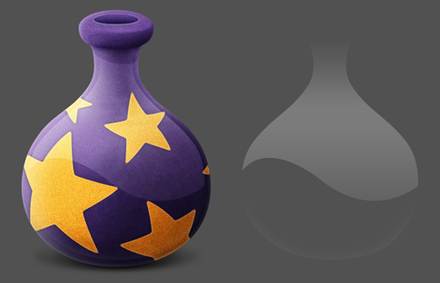
Well it’s finished. Someone like the aqua-style of Apple, it’s easy to accomplish, just add two reflections. TWO reflections, man, don’t forget the ground reflection.
jar_12

To conclude, icon drawing is actually not very difficult, it’s just hard labor – shapes and shades. Shape means the pen tool, shades mean curves-adjusting and the dodge&burn tool. For another instance, pay attention to the rock and vine part of another icon I drew:
floating_vines

Outdated icons

Click the picture to view in full-size

Click the picture to view in full-size

Why there’re so many geeks and high-tech icons? Enjoy all these stuff belong to an outdated mattoid’s collections in his dusty attic in the 18th or 19th century!

Download the PNG files on my Gallery page in deviantArt.com: Download Here.

My Chinese Blog

This is my Chinese personal blog which is designed by myself and totally-self-developed by my friend Pan Wei.

You could visit directly at http://messbook.net/ but I’m afraid it maybe very slowly to open the page because the hosting server is in China mainland.

Some screenshots:

Killertoy Design Project

Killertoy Website - Homepage

Another nostalgia thing.

I’d run a personal Fashion Design Project named Killertoy in 2005. The style is like street, graffiti, hip-hop and fasion. In the meantime I associated with some hip-hop guys (like streetballars, dancers, MCs and DJs) then created an un-registered organization called “W-Unit” (which means Wuhan Union). I designed some cool stuff, found some factories and made these productions out, like tees, dog-tags, stickers (which were very popular), badges and caps. Although it could be pretty messy constantly, I was still very happy at that time, dude.

Killertoy Label

Killertoy Logo

Killertoy Sticker

Killertoy Goods

In May, 2006 I cut off the project since I’d came to Beijing for my new job. So this project has been laid aside for a long, long time. And I think maybe it’ll be laid forever.

Here’re some screenshots of the website:

My Cute Pets

My Cute Pets - Playing

The flash game My Cute Pets is designed for SPILL GROUP which is a multinational corporation headquartered in Amsterdam, the Netherlands.

It’s worth to be mentioned that this game has TWELVE language-versions: English, Brazilian, Dutch, French, German, Italian, Polish, Portuguese, Spanish, Indian, Swedish and Chinese. The localization work was so unbearably.

You can find this flash game in Agame.com (the English version): http://www.agame.com/game/My-Cute-Pets.html

Of course you can also find the Spill Group’s web-sites in other languages. Here’re some screenshots for you to get a quick picture:

Translation – Designing The Moment

Designing The Moment

I accepted the invitation of Turing Culture of The People’s Posts and Telecommunications Press in July, 2008 and began to translate the book Designing the Moment: Web Interface Design Concepts in Action for them.

The book is published on 18th April, 2008 by New Riders Press, and the ISBN is 978-0321535085. The author, Robert Hoekman Jr. is an interaction designer and an expert in the area of usability.

After 4 months’ hard work (well, it’s not REALLY hard, since I’m not a hard-working person,putting lots of attention into my rock bands and enjoying the colorful life), I finished the translation. In fact this book is just about 300 pages and the content is not very rich. However, it still give us bunches of worth-learning solutions about the layout, interactions and even the customer service of web applications (it covers a wide range of different issues, such as Search, Screencast, Blog, Wizard, RSS, Rate, Tag Cloud, Form, etc).

Translating a book is actually a process in which you can LEARN. At first glance, there’re not many brand-new theories or conceptions in this book; but Robert is just like a cat hiding his paws, all the solutions of the points (the stories in the book) are shown by long practice. In other words, if you don’t know much about User Experience, just follow his direction and it’ll be OK; if you have done some researches in this field, all the methods and thoughts behind each solution are also worth learning.

Nonetheless, I just could not stop cursing this King of Clauses and awkward humorist (maybe the reason is the gap between Eastern and Western culture) for his writing style which made me difficult to organize texts in Chinese. Also he likes Oriental concept like “Zen,” but I think he can’t play the ball very well. I had to adopt his perspectives and on the other hand I had to rack my brain in trying to mend the leaks.

However this is still a great book and it’s deserved all my recommendation to everybody. Here’s my Translator’s Words for this book (the original is Chinese):

In the past few years, the Internet has been greatly changed with the swift storm of Web 2.0. All the information sites have become little girls from yesterday in some sence, and more and more openness and diversification never seen before have appeared in the contents of Internet which used to be edited or prescribed by a handful of people yesterday. The “read-only Internet” yesterday has become “readable and writable Internet”, and all of us can certainly add contents or contribute our share as we wish. We publish our blogs and view others’ blogs, and we would leave comments if we have something to say. We create tags to create categories and pigeonhole all the articles, which benefits not only ourselves but also the others. We click and check others’ photos, then upload photos of ourselves. We subscribe any interesting stuff by RSS. We use Google just like we’re searching in a enormous library. We use Wikipedia, and we can discuss or improve the article if we have confidence. We’re learning new technologies, enjoying the streaming videos, communicating thoughts about books and movies with each others, and we are making friends no matter he’s from any corner of this planet. This is a unprecedented “Sharing” world.

Yes, unprecedented. As products developers and designers on the platform which no one could have visions just few years ago, which standard or criteria should we adhere to present a perfect answer sheet in the end? You know, the perfect answer sheet means millions page views, excellent public praise and, the most important, better market reward.

I think you’ve already learn that the protagonist of Web 2.0 is the user. Users are the judge of all the websites and web applications (and of course, the source of revenue). If users think the reserves we provide are worthy, they will promote it by lips, they will write the feeling in their blogs, they will become the admiring fans of you like those Apple fans. Users never mark our products with a model answer; they mark on the basis of every experience on every moment when they giving the orders or getting the feedbacks. If they find it no troublesome during the task, then you get “good;” if they can also find happiness from success, or pleasure of operating, then you get “Perfect.”

So the very first sentence of this book is:

A good user experience is all about good moments.

Robert Hoekman, Jr. is an interaction designer and an expert in the area of usability. He used to work for GoDaddy.com, MacroMedia, Adobe, then he founded Miskeeto, and continue to provide excellent services of user experience for the public. His former book, Designing the obvious explained the explicit design methods on how to make softwares simple and easy-to-use, and this time he’ll uncover the secrets of “moments” with this new book Designing the moment.

When users are in our websites or web applications, it consists of a series of moments. No matter learning new features, logging in, leaving comments, rating, or searching infromations, filling forms, subscribing RSS, even when they are cancling and deleting their accounts with the decision of never come back, all the moment are covered byover 30 stories Robert created with his own personal experience. Every moment is a story; at the end of every story there will be a appropriate solution. Robert will not preach us all the great truths, he will give us the most simple and direct presents – if you don’t know much about User Experience, just follow his direction and it’ll be OK; if you have done some researches in this field, all the methods and thoughts behind each solution are also worth learning.

And, we’re glad to see that he will not beautify himself deliberately. He will show us the whole process including all the exploring and improving after failures, even including how to “steal” other excellent designs. Well, in the first place, the most famous design master will also make mistakes. In the second place, we can learn which is “borrowing good ideas” and which is “plagiarizing shamelessly”. The most important, this book tells us how to find shortages of a design and how to constantly improve it all the time.

Thanks a lot for the invitation of Turing Culture. The process of translating is also a process of learning. I have modified and improved some projects since I learned something useful from it. In the mean time, the copious references of Robert have expanded my horizons, which gives me chances to know something unfamiliar but interesting. So I really hope you guys could read it and I believe that you will find yourself have already raised to a new level after finish the last page of this book.

Mess in Beijing, November, 2008

The Flash Game – OurTank

OurTank - Title

OurTank is like the original Nintendo game TANK (a classical and unfailing game), but I added some new elements (such as mine layers and panzers) and made it more colorful and brilliant. In the game there’re 7 kinds of scenes: urban, port, army base, ancient ruin (like the Great Wall), snowy land, desert and jungle. Actually, every building element can be combined together and builds up any scene if you want.

We’ve developed a backstage system to edit the battle map and set the hardness of each building element.

This game is still in test. Here’re some screenshots:

2009 West Lake Music Festival

Mess Performing

I took part in the 2009 West Lake Music Festival as a guitar-player in ‘Zuo Bin & band’ on Thursday, May 28th. It was very cool when we performing and the audience were all excited.

We played 5 original songs and covered the brilliant Knockin’ On Heaven’s Door (G N’ R version) in the end. For some reason the voice of my 2nd solo sounds not right, but it’s still OK, I think.

There are lots of videos recorded by Sohu.com have been put on the internet and I uploaded one onto the YouTube:

A travel to Phuket Island

Phuket

Last month I went to Phuket Island, Thailand with my wife to spend my holiday. It was a wonderful trip.

We booked a single room in the Lamai Guesthouse for our accommodation through the internet. Although the hotel is not very close to the main beach, it’s very cheap and the attendants are very kind. It costed me only 600 Baht (25 dollars) per day, and I could get free internet access there. If you want, you could rent a motorbike which is very familiar in Phuket and I think the price is about 150 Baht per day.

There are about 7 or 8 beaches around the Phuket Island and they are not very far away with each other – you can get one from another in 20 minutes by motorbike. The most famous one is Patong Beach, but our favourite is Karon Beach because it’s too crowded and flourishing in Patong. We enjoyed the peaceful and clean beach in Karon.

Many tourists go to Phi-Phi Island for diving and snorkeling. It is an amazing island which has gorgeous scenery. The price is about 1,000 Baht (35 dollars) for one person/one day from Phuket to Phi-Phi, which includes free drinks and a buffet lunch. We spent a night on the island.

Oh, of course we ate seafood endlessly! Tong-Yam-Kong is also recommended, and don’t miss the tart-sweet fruit-milkshake!

Phuket - Swimming Pool in a Hotel

Phuket - Motorboats

Phuket - Lobster

Aya Aya Poppin!

Aya Aya Poppin - Menu

The first game I designed for the Ourgame company. Aya Aya Poppin! is from a classic casual game (Nintendo’s Puzzle League) and I added lots of new elements into the system.

When square blocks of the same color are aligned adjacent to one another in vertical or horizontal lines of three or more while supported from underneath, the blocks are cleared, “exploding” (disappearing) from the playing field one by one, from left to right, top to bottom. When more than three blocks are cleared at the same moment, the event is known as a combo. There’s a meter on the lower-left which measures the clearing and keep mounting up. When it arrives the top a bulb (there’re 5 bulbs placed on the right of the meter) will be lighten, and you can use a “time-freezing” bonus. But if there’re 5 shining bulbs, you can use a huge “big bang” bonus if you want. And you maybe have noticed that there’s a buret on the top-right which keep mounting up. When it’s full, a “mummy” square block will fall down from the top, which cannot be moved or cleared by you unless the adjacent blocks are cleared.

Aya Aya Poppin - Blocks

You can choose the “normal” or “training” mode to play. In training mode there will be endless blocks and you can choose whether there’re 5 or 6 kinds of blocks, or whether there’re mummy blocks or not before the game-play. Press [Ctrl] on keyboard to speed-up.

Here’re some screenshots of the game:

You could enjoy the game on my Gallery page in the deviantArt.com (sorry for the only Chinese-language Version): http://messbook.deviantart.com/art/Aya-Aya-Poppin-130161585

Or you could have a quick picture if you see the screencast I threw onto YouTube (there’ll be some delay in the video because of the frame-rate of the recording software):


About Mess

Mess is a designer and a writer/translator in Graphic/UI/Flash fields. Also he plays guitars in several Rock N’ Roll bands in spare time.

He is now living in Beijing, China.